The Coastal Color Palette We Return To, and When We Don’t
NOV 11, 2026
Feel free to leave the sand dollars at the beach
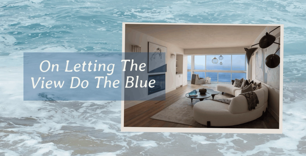
Feel free to leave the sand dollars at the beach
With the ocean right outside your window, and a house designed around honoring that proximity, the interior doesn’t need to copy it — but complement it.
Instead, we let the distinct coastal light guide the color palette. A white wall that looks creamy over breakfast shifts under bright daylight, then picks up pink and gold at sunset. Stone, wood, plaster, and fabric respond to those changes too, so we look at color in relation to the light already moving through the interior.
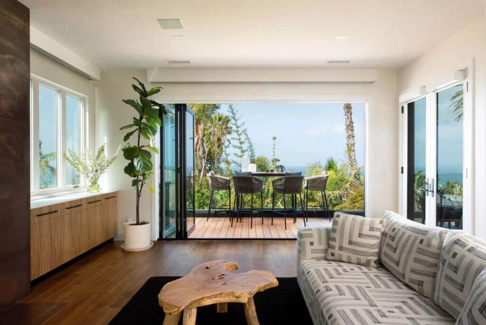
The coastal color palette we come back to time and again relies on warm whites, mineral tones, natural wood, and muted earth colors. You’ll see it across our coastal projects because it works well with natural stone, wood, and plaster and the existing views, and leaves room for whatever art our clients bring with them.
That said, it’s a favorite, not a rule. Some homes call for deeper color or real contrast, often because of a client’s art collection or the architecture itself.
A home overlooking the Pacific already has plenty of blue. But under marine clouds (June gloom, anyone?) the same view can turn silver. Near sunset, the water deepens dramatically. Farther inland, dry grasses, eucalyptus, and weathered stone bring in their own muted Southern California range. With all of that happening outside, a more subdued interior puts the view on full display.
That’s also why we’re picky about the whites on our walls. Cool whites can go stark under strong daylight, while warmer whites sit more naturally beside limestone or oak.
Before deciding on any materials, we test them at the actual jobsite. Limestone that looks warm in a showroom can read very differently beside a west-facing window, and wood can shift just as noticeably. A fabric that seems neutral in one setting may reveal a cool or warm undertone once it’s under natural light.
At Matrix Design Studio, we bring a lot to the table that just can't be relayed in small paint chips or tiny chunks of stone from a slab yard. We have years of knowledge and deep understanding of materials so we know how how to guide the palette conversation without wasting a lot of time on trendy materials that won't translate well to your home.
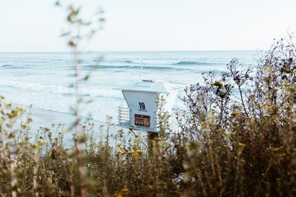
photo: cheyenne arnold
A neutral room looks simple, but getting one right is surprisingly exacting. Without strong color to carry the room, every finish and every place where two materials meet is on display.
At our Refined California Minimalist Residence, stone, wood, and plaster do most of the work, with veining in the stone and grain in the wood adding depth and character. Because those materials are carrying the room, even small decisions matter: honed stone reflects light differently than polished stone while the direction of the grain can change how a whole wall of cabinetry reads.
The materials also have to hold up. Once the house is lived in, coffee lands on the counter, guests come in from the terrace, chairs move, and an art collection slowly grows and changes. Between strong sun and constant traffic, we want to know how a finish handles daily life, not just how it looks on day one.
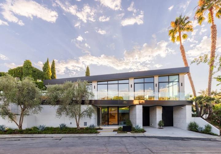
Project 019: Refined California Minimalist Residence
Location: La Jolla, California
Coastal Color Goes Well Beyond Blue
A room can feel coastal without any blue in it at all. Warm limestone, darker walnut, aged bronze, and a mineral-toned textile echo what you actually see along the shore: sandstone bluffs, wet sand, driftwood, and dry coastal grasses. That connection to the surrounding landscape feels more natural than repeating blue simply because the ocean is right there.
Often, the materials themselves supply enough color. Natural stone alone comes in cream, tobacco, rust, gray, or green, depending on the slab. Walnut may appear almost chocolate in lower light, while bronze develops darker tones as it ages.
Textiles let us adjust color in smaller doses. An upholstery fabric might pick up a mineral undertone from the flooring, while a rug can introduce a deeper tone without changing the architectural palette.
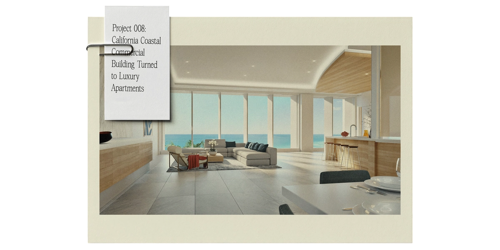
Custom homes take time to plan and build. By move-in day, whatever color was trending at the first meeting may already feel dated. So even when a room needs strong color, we pull it from something with staying power.
A deep green drawn from a client’s painting can still belong in the room years later because it came from something they love. Limestone chosen for the way its texture responds to local light ages well too. Wood changes slowly over time, while a finish with a good patina only gets more interesting once the newness wears off.
A neutral foundation also leaves room for new furniture and a growing collection without forcing a complete rethink of the interior.
Years later, when the art has moved around and dinner is served at a table carrying a few marks of family life, the colors should still look at home.
Planning a coastal home or major remodel? Start a conversation with Matrix Design Studio about a palette built around your setting and the way you live there.